All writing · 16 Mar 2026 · 10 min read
The Nano Banana Pro Prompting Guide: 6 Techniques With Real Examples
A hands-on guide to prompting Gemini 3 Pro for text rendering, character consistency, style transfer, brand mockups, localization, and photo editing — with real examples and exact prompts.
Google's Gemini 3 Pro — codenamed Nano Banana Pro — isn't just another image generator. It's a native multimodal model that thinks in images the way GPT thinks in text. Unlike diffusion-based tools (Midjourney, DALL-E, Stable Diffusion), it generates images as part of a conversation — meaning it can read your reference photos, understand context from prior messages, and edit images surgically.
I've been using it heavily for client work, social media, and brand assets. Here's what I've learned about getting world-class results — with real examples from my own projects.
Why Nano Banana Pro Is Different
| Feature | Diffusion Models (Midjourney, DALL-E) | Nano Banana Pro (Gemini 3 Pro) |
|---|---|---|
| Architecture | Diffusion / transformer hybrid | Native multimodal autoregressive |
| Text rendering | Struggles with accuracy | Renders text natively and accurately |
| Image editing | Needs inpainting masks | Conversational — "change X to Y" |
| Reference images | Limited (image-to-image) | Up to 14 reference images per prompt |
| Character consistency | Requires LoRA / training | Built-in face matching from reference photos |
| Multi-turn | Each generation is isolated | Full conversation memory |
| Aspect ratios | Fixed or custom crop | 1:1, 3:4, 4:3, 9:16, 16:9 native |
The Anatomy of a Great Prompt
After hundreds of generations, I've found that the best prompts follow a consistent structure:
1. Lead with intent
Tell the model what you're making and why. Don't just describe — direct.
❌ Don't:
A business card on a desk✅ Do:
Create a professional brand mockup showing our logo on a premium black business card lying on dark marble2. Be specific about composition
Describe layout, positioning, and spatial relationships explicitly.
❌ Don't:
Show three versions of a portrait✅ Do:
Create a triptych showing the same person in three distinct artistic styles, side by side in one wide image:
    LEFT: Watercolor portrait — soft washes, visible brush strokes
    CENTER: Bold pop art — flat colors, thick outlines, Ben-Day dots
    RIGHT: Retro-futuristic — neon grid lines, synthwave colors
3. Anchor your design system
Always specify exact colors, fonts, and style references. The model respects hex codes remarkably well.
Dark background (#111111). Signal-red (#E63B2E) as primary accent.
Beige (#E8E4DD) for secondary elements. Swiss-design inspired, minimal, editorial.
4. End with constraints
Tell the model what NOT to do. This prevents the most common failure modes.
No text on the image. No logos. No watermarks.
Style: architectural, clean, modern — NOT photorealistic, NOT cartoonish.
6 Techniques With Real Examples
I generated all of these for my brand bestguy.ai to show each technique in action. Every image below was created with Nano Banana Pro, and I'm sharing the exact prompts I used.
Technique 1: Text Rendering — Infographics & Data Viz
Nano Banana Pro can render text accurately inside images — a massive weakness of every diffusion model. This makes it ideal for infographics, social cards, and data visualizations.
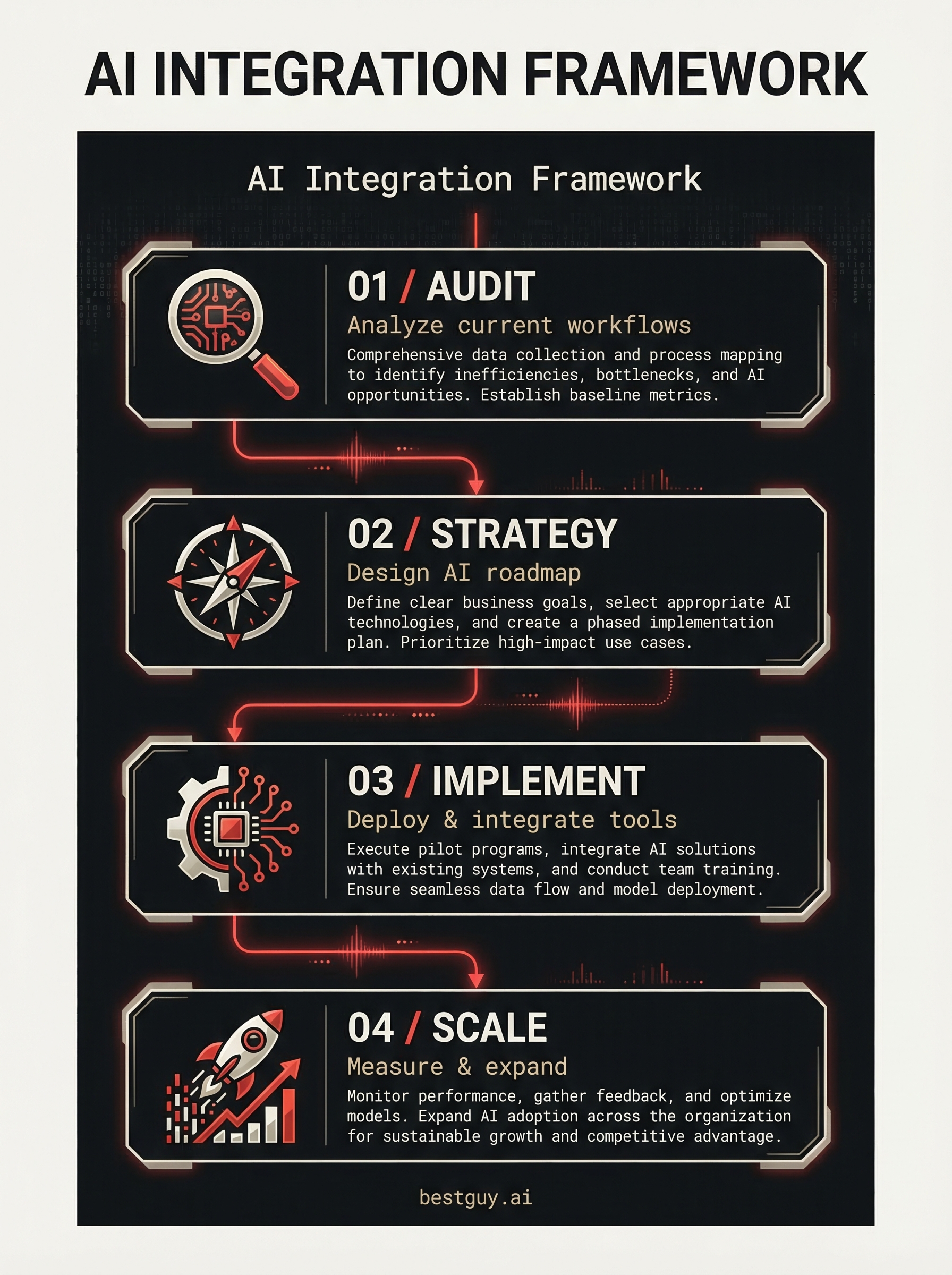
The prompt I used:
Create a professional infographic titled "AI Integration Framework"
for a digital consulting brand.

Dark background (#111111). Clean editorial layout.

Structure it as a vertical flow with 4 connected steps:
Step 1: "AUDIT" — with a magnifying glass icon, subtitle "Analyze current workflows"
Step 2: "STRATEGY" — with a compass icon, subtitle "Design AI roadmap"
Step 3: "IMPLEMENT" — with a gear icon, subtitle "Deploy & integrate tools"
Step 4: "SCALE" — with a rocket icon, subtitle "Measure & expand"

Connect the steps with thin signal-red (#E63B2E) lines flowing downward.
Use off-white (#F5F3EE) for main text, beige (#E8E4DD) for subtitles.
Small text at the bottom: "bestguy.ai"
Bold sans-serif headlines, clean mono-spaced labels.
Swiss-design inspired, architectural, geometric, magazine-quality.
Pro tip: When rendering text, use ALL CAPS for headings and specify the exact font style ("mono-spaced", "bold sans-serif"). The model handles these cues better than vague "nice font" requests.
Technique 2: Character Consistency — Same Person, Multiple Scenes
This is where the native multimodal architecture really shines. Upload a reference photo and the model maintains face consistency across completely different settings and lighting conditions.
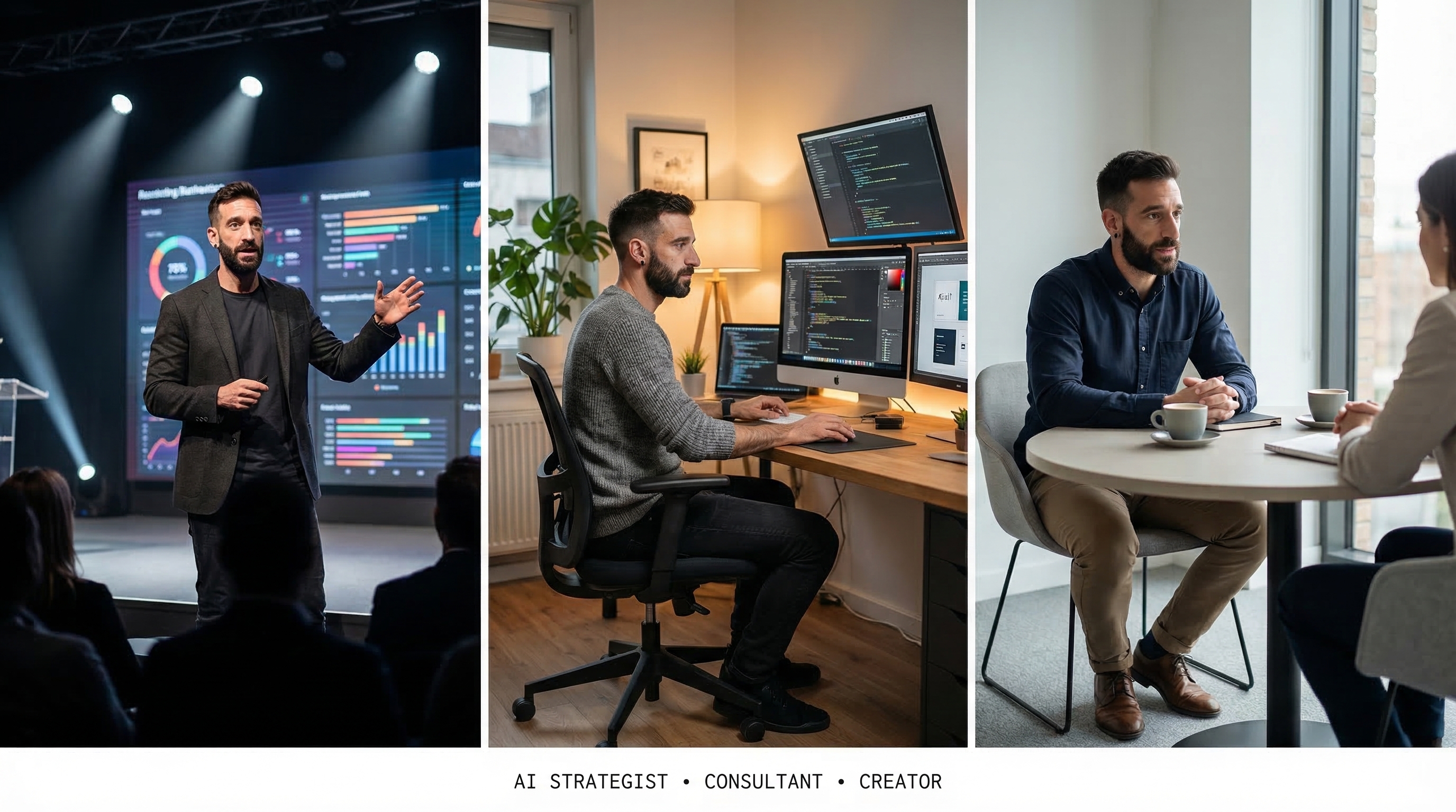
The prompt I used (with my photo as reference):
Create a triptych image showing the same person (from the reference photo)
in three professional scenarios, side by side in one wide image:

LEFT PANEL: The person giving a keynote presentation on a modern stage
with a large screen behind them showing data visualizations.
Wearing a dark blazer. Dramatic stage lighting.

CENTER PANEL: The same person in a creative studio, sitting at a desk
with multiple monitors showing code and design work.
Warm ambient lighting. Casual but professional attire.

RIGHT PANEL: The same person in a one-on-one consulting session,
sitting across from a client at a minimalist meeting table.
Coffee cups on the table. Natural window light.

CRITICAL: The person MUST look EXACTLY like the reference photo —
same face, same beard, same features. 100% likeness fidelity.
Pro tip: The word "CRITICAL" followed by likeness instructions dramatically improves face consistency. Always include it when working with reference photos.
Technique 3: Style Transfer — One Face, Many Art Styles
Take a single reference photo and reimagine it across wildly different artistic styles — while keeping the face recognizable in every version.
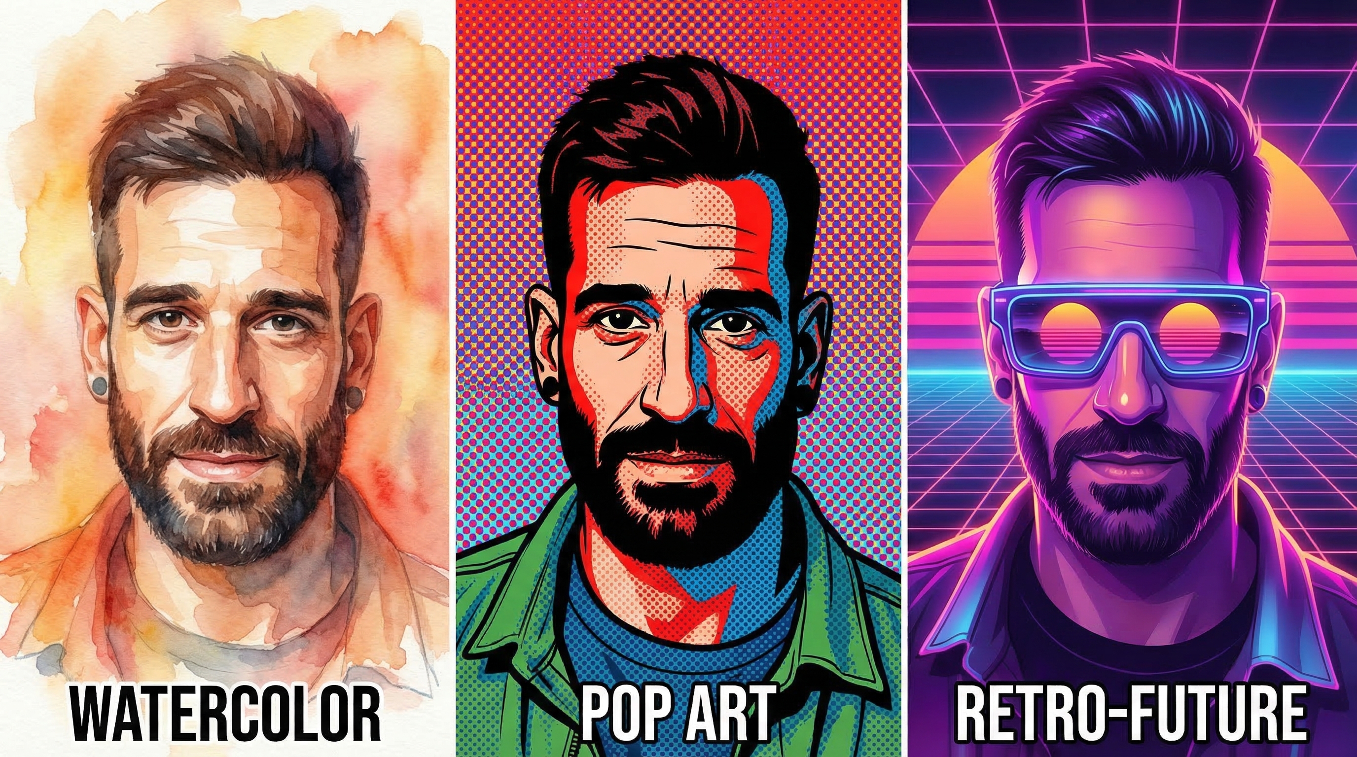
The prompt I used:
Create a triptych showing the same person (from the reference photo)
reimagined in three distinct artistic styles, side by side in one wide image:

LEFT: Watercolor portrait — soft washes, visible brush strokes,
warm tones, artistic and expressive.

CENTER: Bold pop art illustration — flat colors, thick black outlines,
Ben-Day dots pattern in background, Warhol-inspired. Vibrant red and blue.

RIGHT: Retro-futuristic digital art — neon grid lines, synthwave sunset colors,
the person wearing futuristic glasses. 80s sci-fi aesthetic.

CRITICAL: The person's face MUST be recognizable in ALL three versions —
same face, same beard, same features. 100% likeness fidelity
even in stylized versions.

Clean layout with thin white dividers.
Labels below each: "WATERCOLOR" "POP ART" "RETRO-FUTURE" in small mono caps.
Pro tip: Naming the art styles explicitly ("Warhol-inspired", "synthwave") gives much better results than generic descriptions. The model has strong knowledge of art movements.
Technique 4: Brand Mockups — Logo on Real Products
Upload your logo and see it applied to photorealistic product mockups — no Photoshop templates needed.
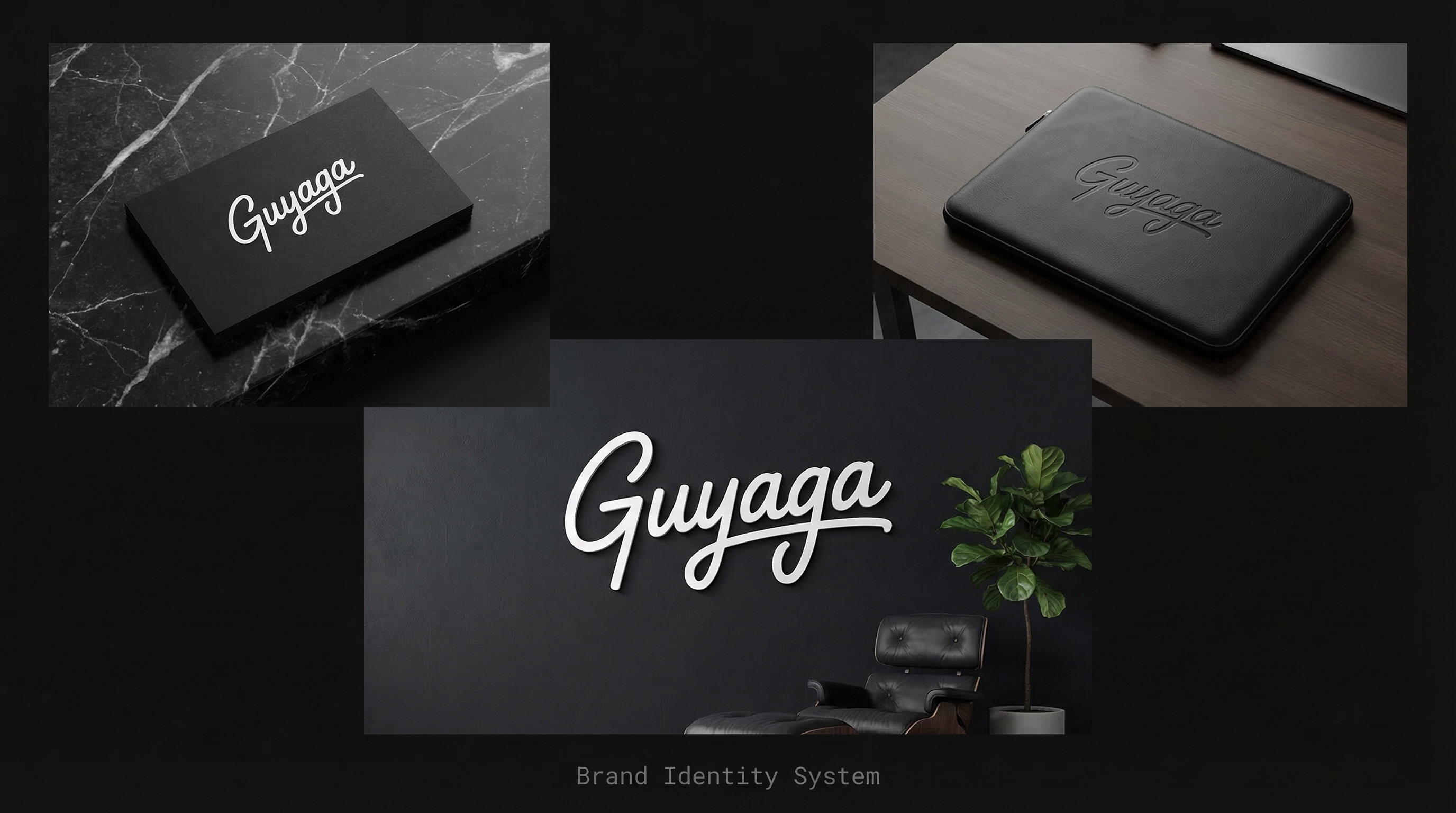
The prompt I used (with my logo as reference):
Create a professional brand mockup image showing the provided logo
applied to three different surfaces in a single elegant composition:

TOP LEFT: The logo printed on a premium black business card
lying on a dark marble surface. The logo appears in white/off-white.

TOP RIGHT: The logo embossed on a sleek black laptop sleeve/case,
sitting on a clean desk.

BOTTOM CENTER: The logo as a large white wall sign mounted on a
dark charcoal wall in a modern minimalist office space,
with a designer chair and plant visible.

Clean editorial layout with generous spacing between mockups.
Dark background (#111111) tying the compositions together.
Photorealistic product photography style. Premium and sophisticated feel.
Small text at bottom: "Brand Identity System" in light gray monospace.
Pro tip: For logo mockups, specify the surface material ("dark marble", "embossed leather") and the logo color treatment ("white/off-white", "gold foil"). This prevents the model from distorting your logo's appearance.
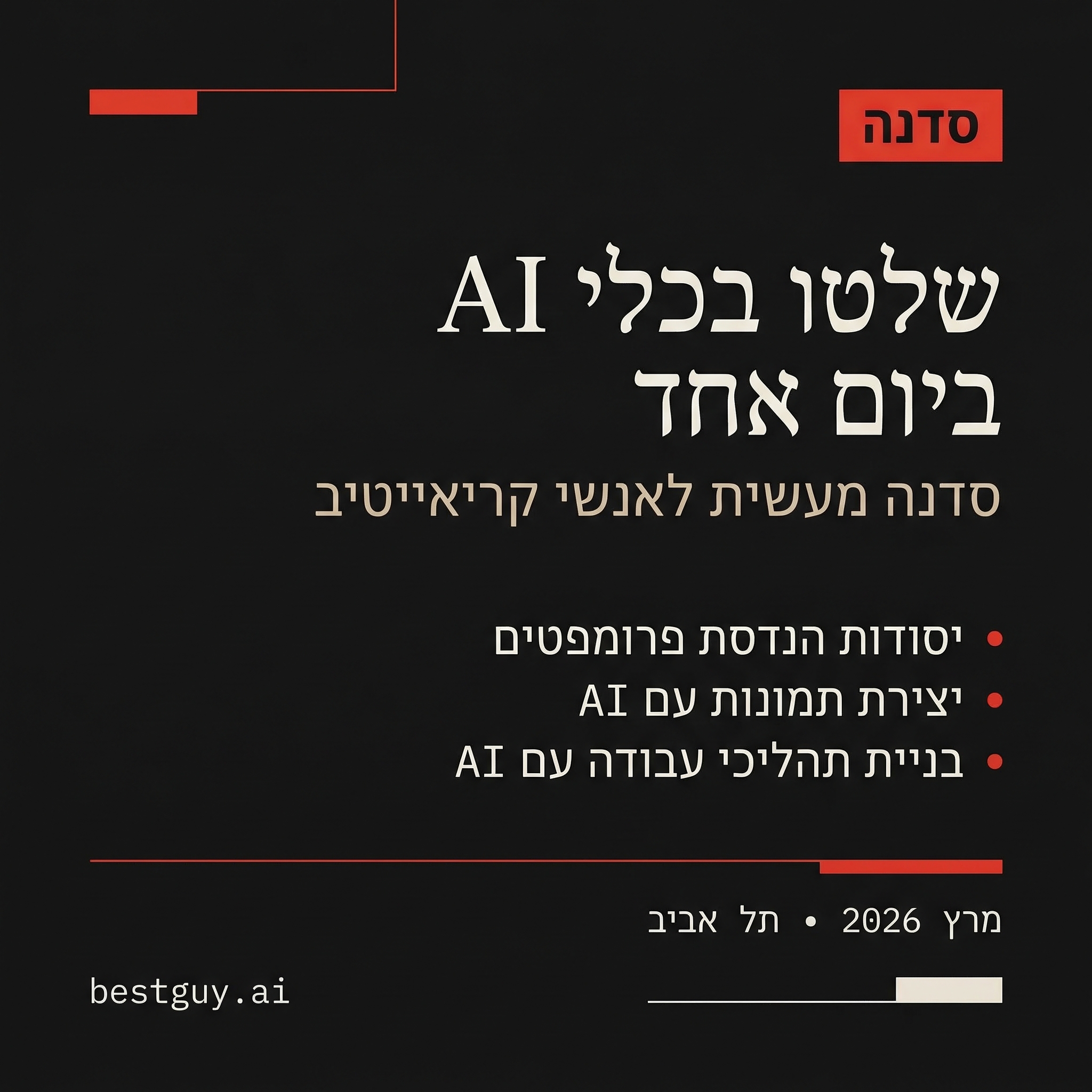
Technique 5: Localization — One Design, Multiple Languages
Create the exact same design in different languages. Here I made a workshop announcement in English and Hebrew — the model handles RTL text and mirrors the layout correctly.
English version:

Hebrew version (RTL):
The English prompt:
Create a professional social media announcement card.
Dark background (#111111). Swiss-design inspired, minimal, editorial.

Layout:
- Small red (#E63B2E) mono label at top: "WORKSHOP"
- Large elegant serif headline in off-white: "Master AI Tools in One Day"
- Subtitle in beige (#E8E4DD): "A hands-on workshop for creative professionals"
- Three bullet points with red dots:
  • "Prompt Engineering Fundamentals"
  • "Image Generation with AI"
  • "Building AI Workflows"
- A thin red horizontal divider line
- Bottom section: "March 2026 • Tel Aviv" in small mono text
- "bestguy.ai" in bottom right corner
The Hebrew prompt:
Create a professional social media announcement card — a Hebrew RTL version.
Dark background (#111111). Swiss-design inspired, minimal, editorial.
ALL TEXT MUST BE IN HEBREW, reading right-to-left.

Layout (mirrored for RTL):
- Small red (#E63B2E) mono label at top: "סדנה"
- Large elegant serif headline in off-white: "שלטו בכלי AI ביום אחד"
- Subtitle in beige (#E8E4DD): "סדנה מעשית לאנשי קריאייטיב"
- Three bullet points with red dots:
  • "יסודות הנדסת פרומפטים"
  • "יצירת תמונות עם AI"
  • "בניית תהליכי עבודה עם AI"
- "bestguy.ai" in bottom left corner
Pro tip: For RTL languages, explicitly state "ALL TEXT MUST BE IN HEBREW, reading right-to-left" and specify "Layout (mirrored for RTL)". Also move brand elements to the opposite corner (right → left) for proper RTL design.
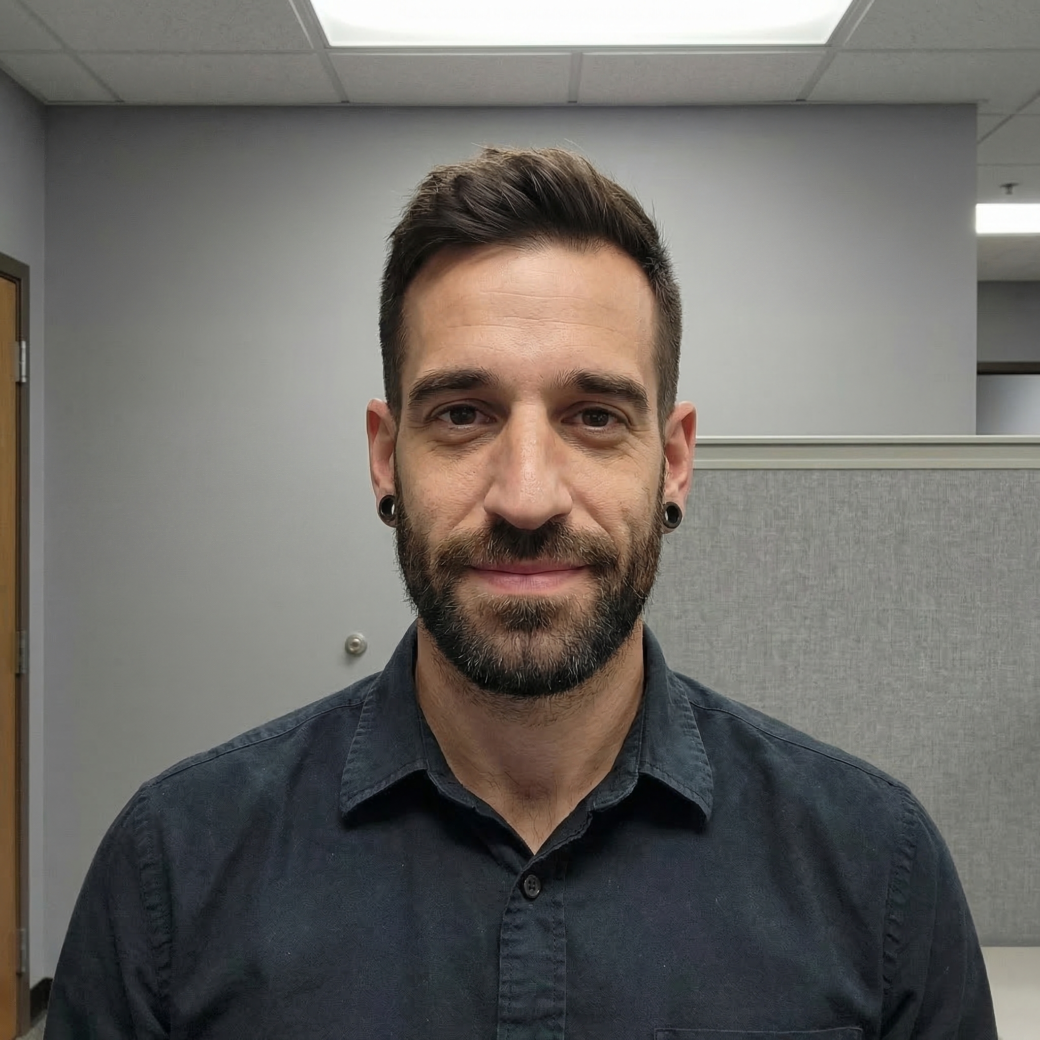
Technique 6: Photo Editing — Before & After Lighting
Upload a flat, boring photo and transform it with cinematic lighting — all through natural language. No Lightroom presets, no Photoshop layers.
Before — flat office lighting:
After — cinematic golden-hour upgrade:

The editing prompt (with the "before" photo as reference):
Take this reference photo and dramatically improve its lighting and mood:

1. Change the flat office lighting to warm, cinematic golden-hour side lighting
2. Add subtle depth-of-field blur to the background
3. Add a warm color grade — slight orange/amber tones
4. Make the background a rich dark gradient instead of plain wall
5. Add subtle rim lighting on the hair/shoulders

Keep the person EXACTLY the same — same face, same expression, same clothing.
Only change the lighting, background, and color grading.
Pro tip: Use numbered lists for editing instructions. The model follows them sequentially and you can easily debug which step didn't land. Also always specify what should NOT change.
The Technical Setup
All examples above were generated using the @google/genai SDK. Here's the core pattern:
import { GoogleGenAI } from "@google/genai";

const ai = new GoogleGenAI({ apiKey: process.env.GEMINI_API_KEY });

const response = await ai.models.generateContent({
  model: "gemini-3-pro-image-preview",
  contents: [
    { text: "Your prompt here" },
    // Optional: reference images
    { inlineData: { mimeType: "image/jpeg", data: base64ImageData } },
  ],
  config: {
    responseModalities: ["TEXT", "IMAGE"],
    imageConfig: {
      aspectRatio: "16:9",  // 1:1, 3:4, 4:3, 9:16, 16:9
      imageSize: "2K",       // or "1K", "4K"
    },
  },
});

// Extract the generated image
for (const part of response.candidates[0].content.parts) {
  if (part.inlineData && !part.thought) {
    const buffer = Buffer.from(part.inlineData.data, "base64");
    fs.writeFileSync("output.png", buffer);
  }
}
Key parameters
| Parameter | Options | Notes |
|---|---|---|
aspectRatio | 1:1, 3:4, 4:3, 9:16, 16:9 | Set before generation, can't change after |
imageSize | 1K, 2K, 4K | 2K is the sweet spot for quality vs. speed |
responseModalities | ["TEXT", "IMAGE"] | Must include IMAGE for generation |
| Reference images | Up to 14 per request | Pass as inlineData with base64 |
My Prompting Cheat Sheet
| Technique | Key Phrases to Include |
|---|---|
| Text rendering | Specify exact text in quotes, font style, hierarchy (headline vs. subtitle) |
| Character consistency | "CRITICAL: MUST look EXACTLY like the reference photo — 100% likeness fidelity" |
| Style transfer | Name the art movement explicitly ("Warhol-inspired", "synthwave", "watercolor") |
| Brand mockups | Describe surface materials and logo color treatment, use "photorealistic product photography" |
| Localization | "ALL TEXT MUST BE IN [LANGUAGE]" + specify text direction + mirror layout description |
| Photo editing | Numbered list of changes + "Keep the person EXACTLY the same" |
| Negative constraints | "No text. No logos. No watermarks. NOT photorealistic, NOT cartoonish." |
| Color precision | Always use hex codes: "#E63B2E" not "red" |
| Layout control | Use spatial terms: "TOP LEFT", "BOTTOM CENTER", "LEFT PANEL" |
| Quality boost | "Swiss-design inspired, editorial, magazine-quality, architectural" |
Key Takeaways
-
Structure beats poetry. Clear, organized prompts with spatial directions and numbered steps outperform flowery descriptions every time.
-
Hex codes are your friend. The model respects exact color values far better than color names. Build a design system and reference it in every prompt.
-
Reference images are superpowers. Character consistency and brand mockups are only possible because Nano Banana Pro can actually "see" your reference photos — not just interpret text descriptions of them.
-
Multi-turn editing is the killer feature. Unlike diffusion models where each generation is isolated, you can have a conversation: "Make the background darker. Now add a red accent. Now swap the headline."
-
Constraints prevent chaos. Always end with what you DON'T want. "No text, no logos, no watermarks" prevents 80% of common issues.
-
Name your styles. "Warhol-inspired pop art" gives better results than "colorful artistic portrait." The model has deep art history knowledge — use it.
Nano Banana Pro isn't replacing your design tools. But for rapid prototyping, social media content, brand mockups, and creative exploration — it's the fastest path from idea to polished visual I've ever used.
Based on prompting techniques from Google's official Nano Banana Pro guide and Google Cloud's Ultimate Prompting Guide.
AI · Prompt Engineering · Tools · Tutorial